How To Create A Hamburger Navigation Menu

The hamburger menu is a website navigation element. It is a button that consists of three parallel horizontal lines. Clicking this button results in a menu being revealed.
There are two main benefits of using hamburger navigation with your website:
- It saves space on your web pages. This is especially relevant to web sites optimized for mobile devices.
- The hamburger navigation menu is a very popular element; it gives easy access to your navigational links, which improves the overall user experience.
In this post, I will describe how to create a hamburger navigation system using Dropdown Menu Generator. Knowledge of CSS, HTML, PHP, or JavaScript is not required.
Navigation Structure
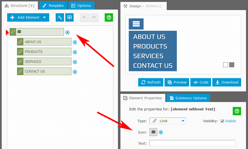
A classic hamburger navigation panel consists of the main root element with the hamburger icon and the dropdown list of child elements.
Creating a structure for the menu is a simple way. Using the Structure Editor, based on drag-and-drop functionality, we add elements and rearrange them. To make an element as a child for the parent element, we drag it and put it to the same location with a small indent on the left.
In our structure, the main element includes only the hamburger icon. Child elements include text labels and links to the destination pages.

Appearance
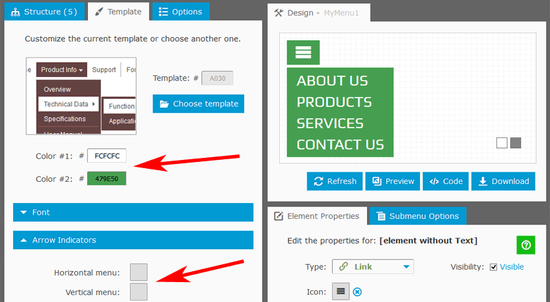
A template defines the look of the menu. You can choose the desired template from the library and customize it. To set a new color gamma for the entire template, just two mouse clicks are necessary.
A standard hamburger menu does not include arrow indicators; so, we leave the corresponding fields empty.
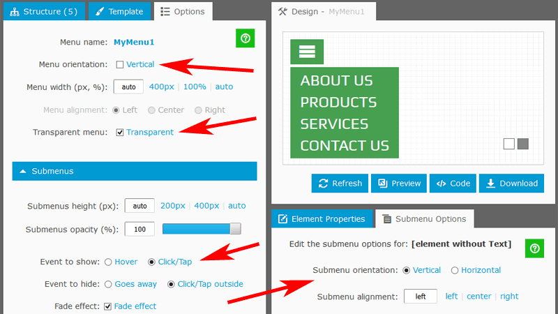
It is also recommended to enable the "Transparent" option (under the "Options" Tab); the navigation bar will be displayed as a single hamburger icon without background.

Behavior and Layout
On this step, we define the events to show/hide the submenu. The main root element with the hamburger icon is always visible. We set the "Event to show" to "Click/Tap" and the "Event to hide" to "Click/Tap outside".
In Dropdown Menu Generator, an entire navigation system is a combination of two parts: Main Menu and Submenu. In the hamburger menu, the single root element with an icon is Main Menu; the list with child elements is Submenu.
By default, Main Menu has a horizontal orientation (the "Orientation" option is under the "Options" Tab). It means that Submenu displayed underneath the main root element. If the menu has a vertical orientation, the Submenu displayed on the right. Depending on the structure of your site, you can choose the proper orientation. You can also set the orientation of Submenu (the "Orientation" option is under the "Submenu Options" Tab); it defines the format of the list with child elements.

Adding the menu to your website
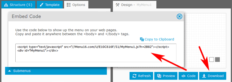
To add our menu to the web page, we copy the Embed Code and paste it in the page HTML anywhere between the <body> and </body> tags. Pretty simple and efficient.
If you prefer to use the menu as a part of your site, just download it to the local disk and follow the enclosed instructions.

Links